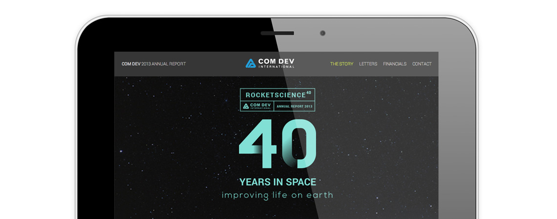
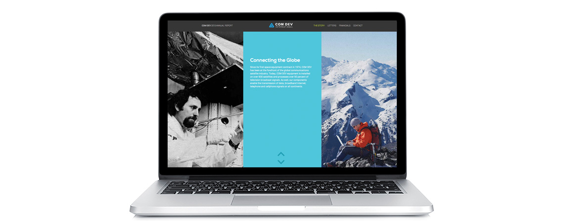
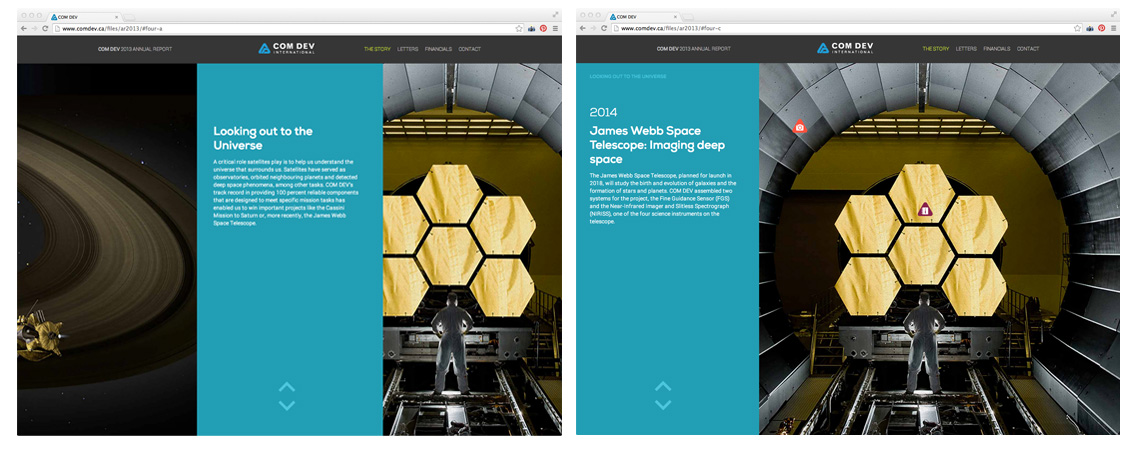
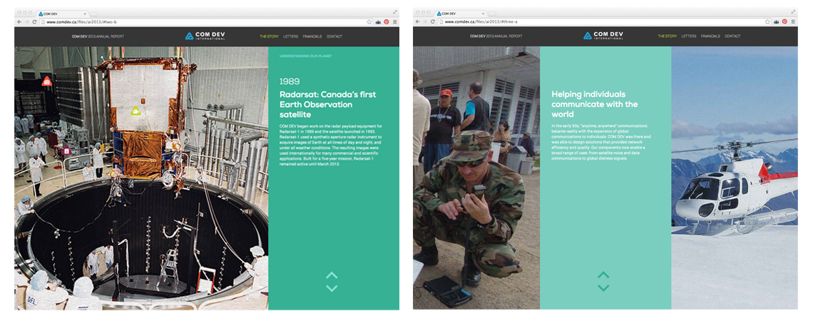
I led the creative and development teams to build this one-page website annual report. The page was designed so that the user experienced the story by scrolling down as panels shifted left and right, revealing links to additional video and photo content. Instead of just focusing on the company’s technological advances, I developed the strategy to highlight the human element as well. It was important to balance what COM DEV had achieved in space with what is most important to our investor audience: how COM DEV is improving lives here on earth and building a profitable business while doing so.
To celebrate the company’s 40th anniversary in space, images of the technology contrast with images of real world use cases showcasing the importance of COM DEV’s products. I pushed the team to consider alternate colour palettes and we finally settled on the blues and mint green tones inspired by Gucci’s fall fashion lineup providing a modern feel with a subtle retro nod.


