

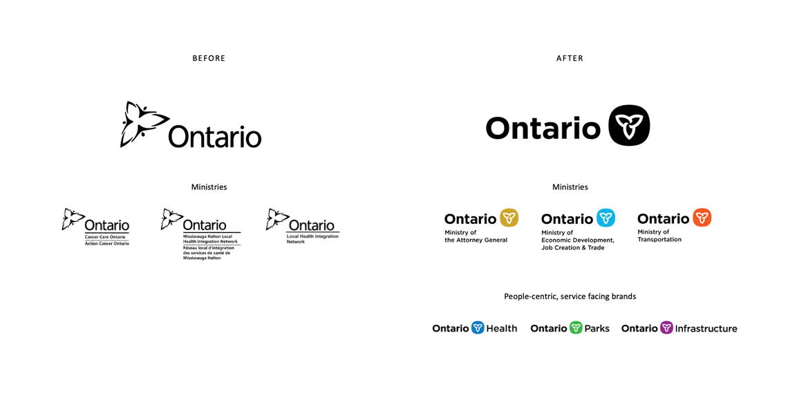
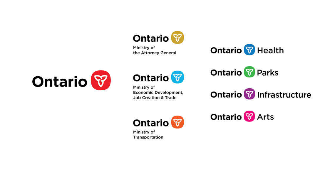
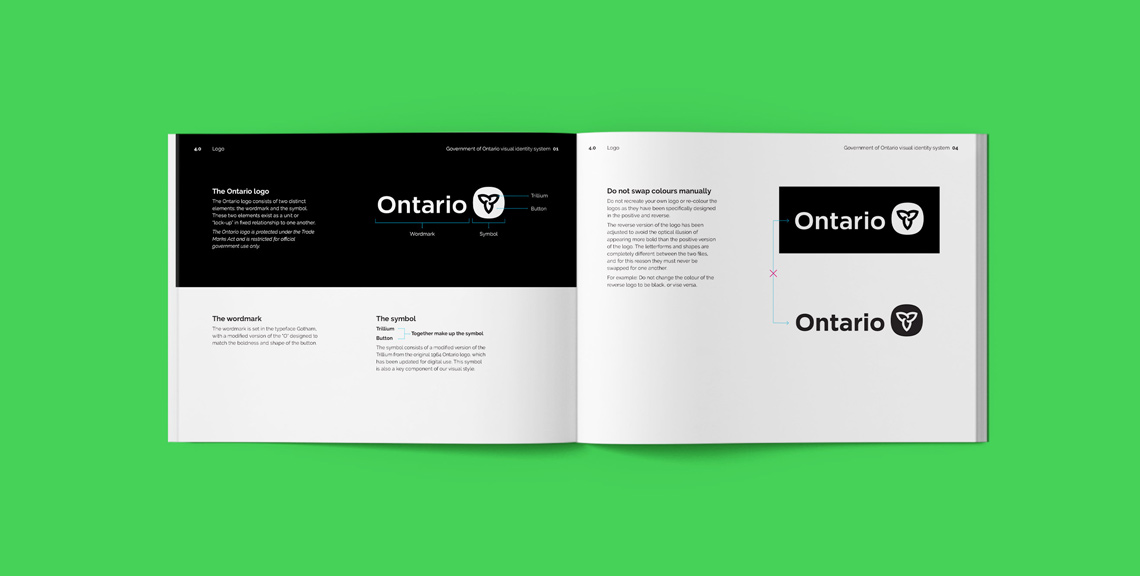
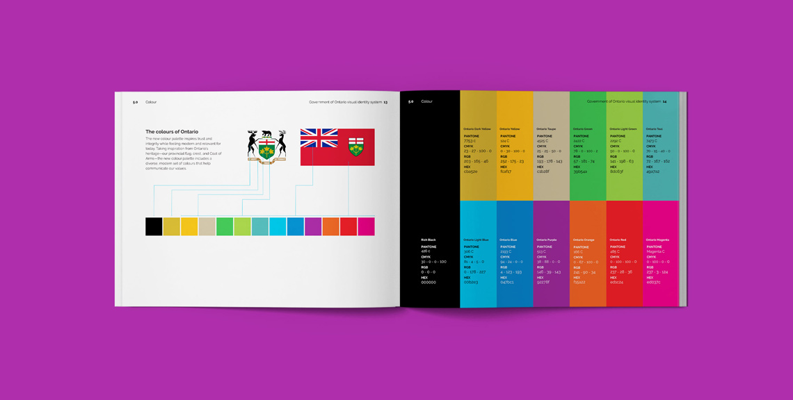

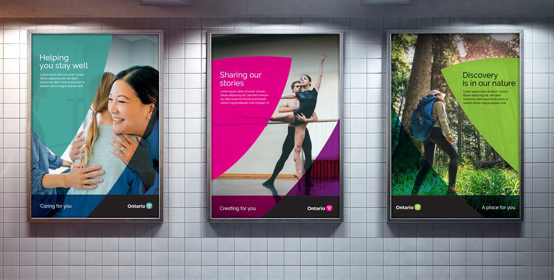
Over the years an abundance of distinct logos and brands had been developed for Ontario government ministries and agencies. The result was a lot of money being spent on all of these competing visual systems, and a confusing, fragmented brand that felt institutional instead of personal. I worked with the Ove team to help bring clarity and a human, people-centric element to the Ontario brand, overseeing the development of the visual expression. Following an audit, workshop and extensive research, a new brand architecture was developed, along with a new logo and complete visual identity system. The new logo reconnects with Ontario’s heritage Trillium while celebrating diversity. A Trillium graphic element was developed to further build brand recognition as part of a flexible visual system.
My contributions included:
- Supporting and observing visual research sessions
- Developing and leading design-focused client workshops
- Overseeing a team of designers to develop creative concepts that translate the research, brand strategy and vision into a visual brand expression
- Communicating and selling through the creative design thinking and concepts through a series of presentations
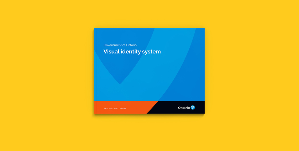
- Leading the development and testing of a new colour palette, templates and full brand guidelines
- Training the client team on how to use the new visual identity system