


Sport Chek’s strategy had evolved and found that the visually identity lacked a clear connection to its core: Canada’s destination for sport.
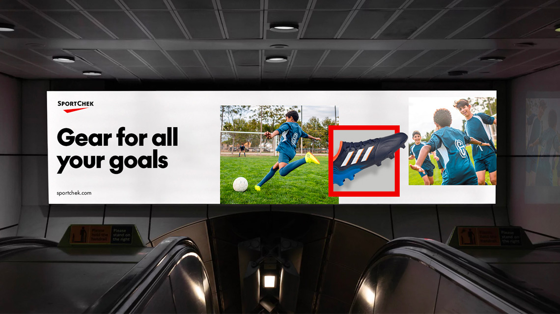
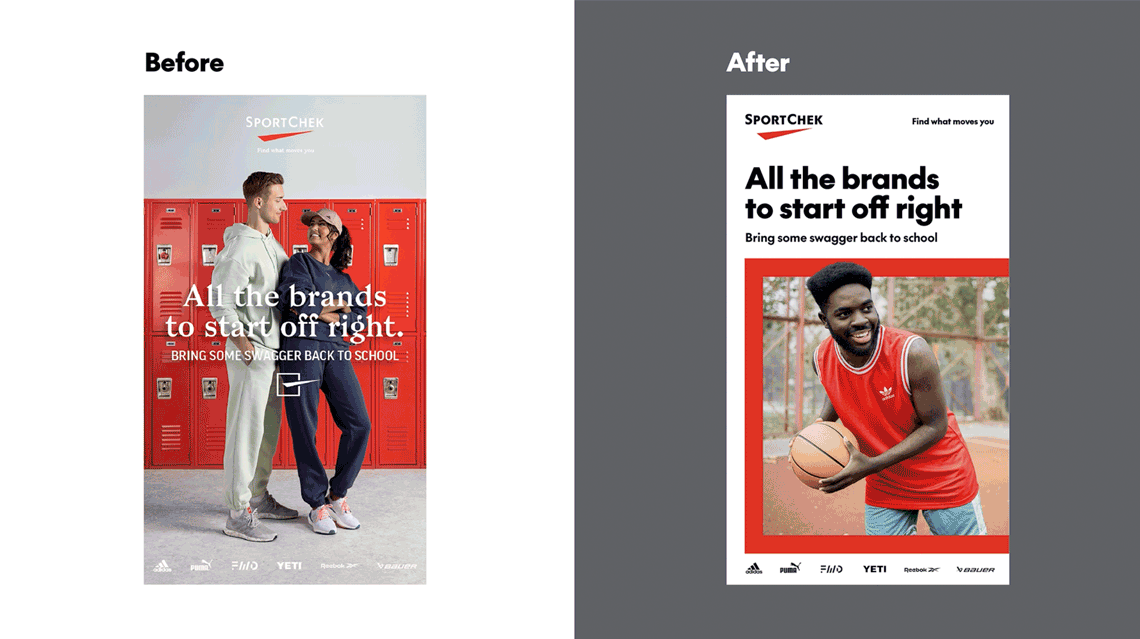
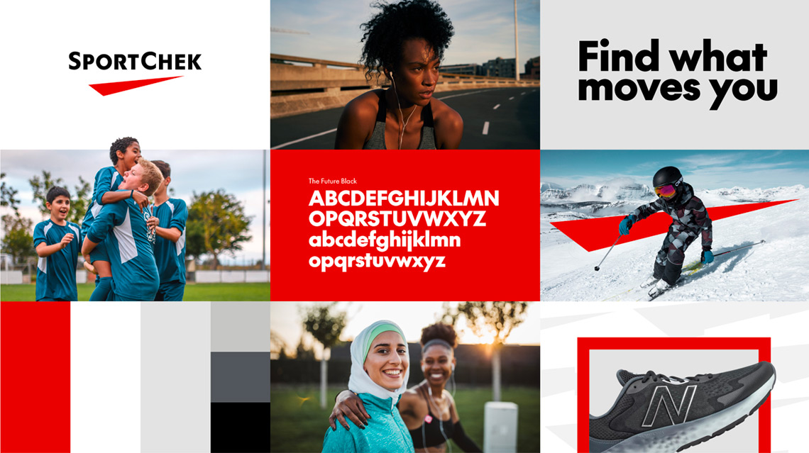
The new foundational visual language brought an update to the logo to make it bolder giving it more prominence. We reimagined the check-box graphic that had been used in a literal way and split the elements apart, giving us a dynamic Supergraphic Chek with a strong sense of motion and a Frame element that could be used to highlight images and content. A new single typeface, The Future, is bold and distinctive, replacing the confusing mixture of serif and sans serif fonts previously in use.
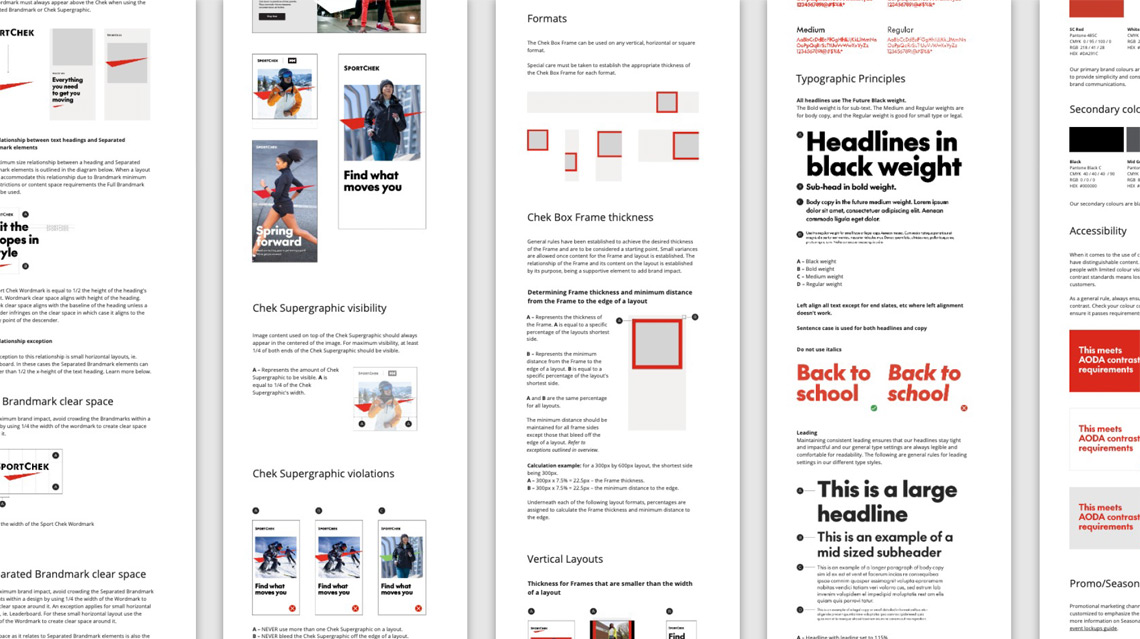
Our process included extensive stakeholder interviews across the organization to understand what was working and what needed improvement with the current brand system. Various territories were explored and ultimately the chosen direction strongly connected back to the goal of positioning the retailer as Canada’s destination for sport. Following the development of bold, dynamic foundational elements including logo, typeface, colour, tagline and graphic elements, my team worked to blow out full, detailed guidelines for each channel.