Our direction for this annual report was to produce a clean, elegant design where the information on various mines and operations could be easily reviewed and compared.
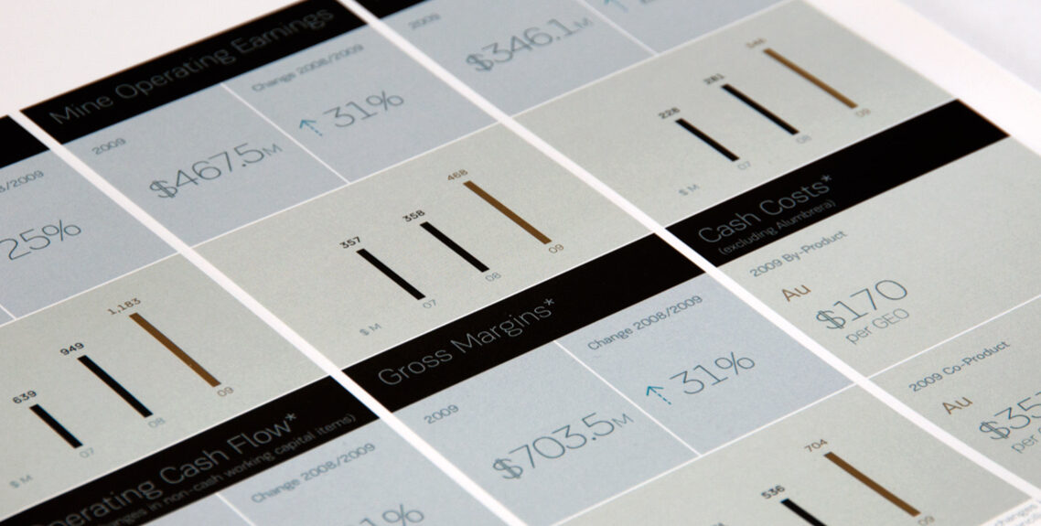
The information was designed into dashboards, with the same format and placement for each mine so that numbers were consistently presented across the report. The thin elegant typography influenced the style of the graphs and bar charts.
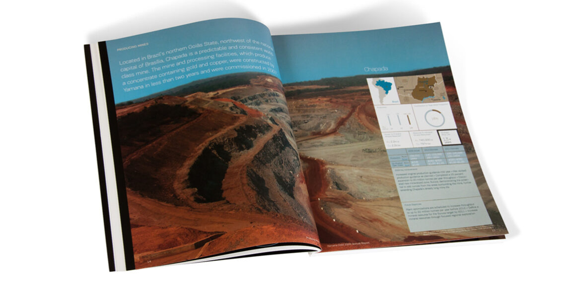
The company had a great set of photography to work with to feature their properties, so we made sure to select hero shots and print them full bleed on double-page spreads to maximize impact, placing the dashboard of relevant data on top.
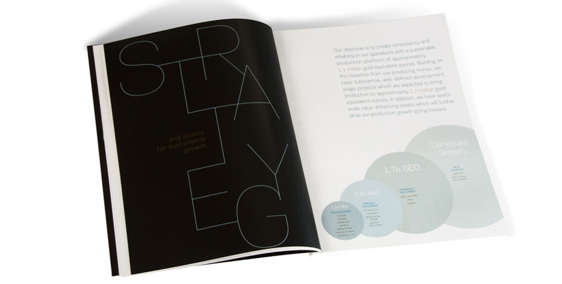
I researched and tested several typefaces before settling on PF Encore Sans, a family with a great range of weights and a beautiful ultra-thin that I developed into typographic artwork.
Colours were soft water tones accented with strong black accents and hints of gold to create a look that is both elegant and very strong at the same time.
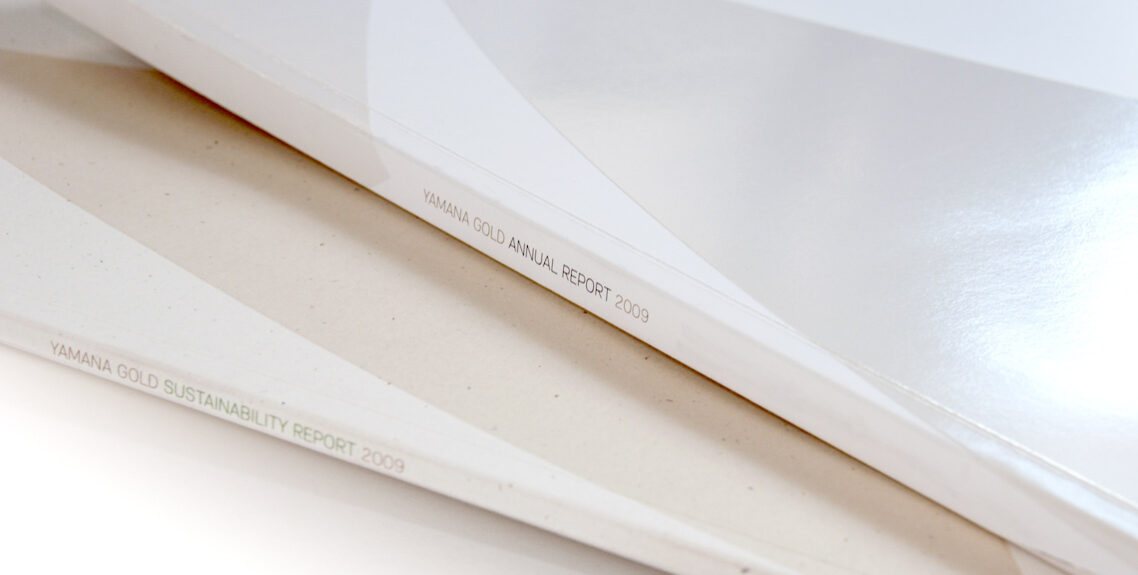
The cover included a tinted spot UV varnish for an understated effect. When we later designed the company’s corporate responsibility report, we went with a natural fibre paper in a similar tone to create a publication set.


